
For a new wine range, Dutch retailer SPAR, needed a new brand identity that embraces the happy moments together and helps choosing the right wine. Making the right choice when it comes to wine can be complicated: origin, grape variety, which meal will be accompanied and what can I expect from the taste.
That having said, it is no longer necessary to go to exclusive wine boutiques in order to get a decent wine. Since a few years, Supermarkets invest in having wine buyers on the staff who fill the shelves with drinkable and affordable wine. In order to show that expertise, they are offering their chosen wine range under their own brand. The brand value of SPAR is convenience: “if life gives you busy craziness, SPAR helps you quickly to turn these moments into social highlights.” The design needs to do justice to the richness of tastes but at the same time helping the customer with the choice.

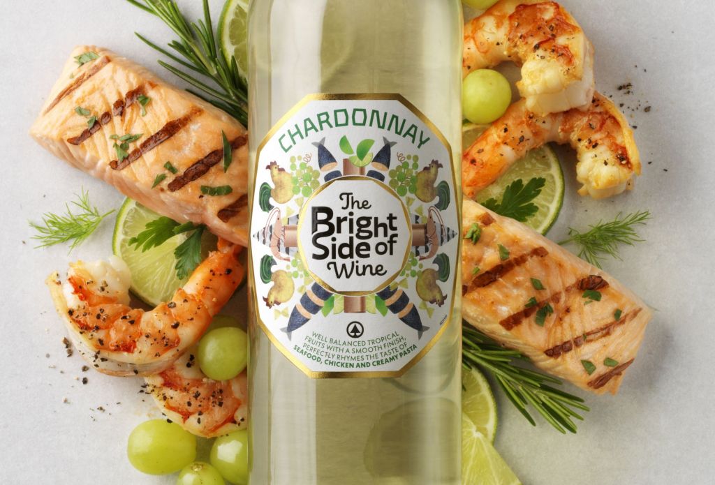
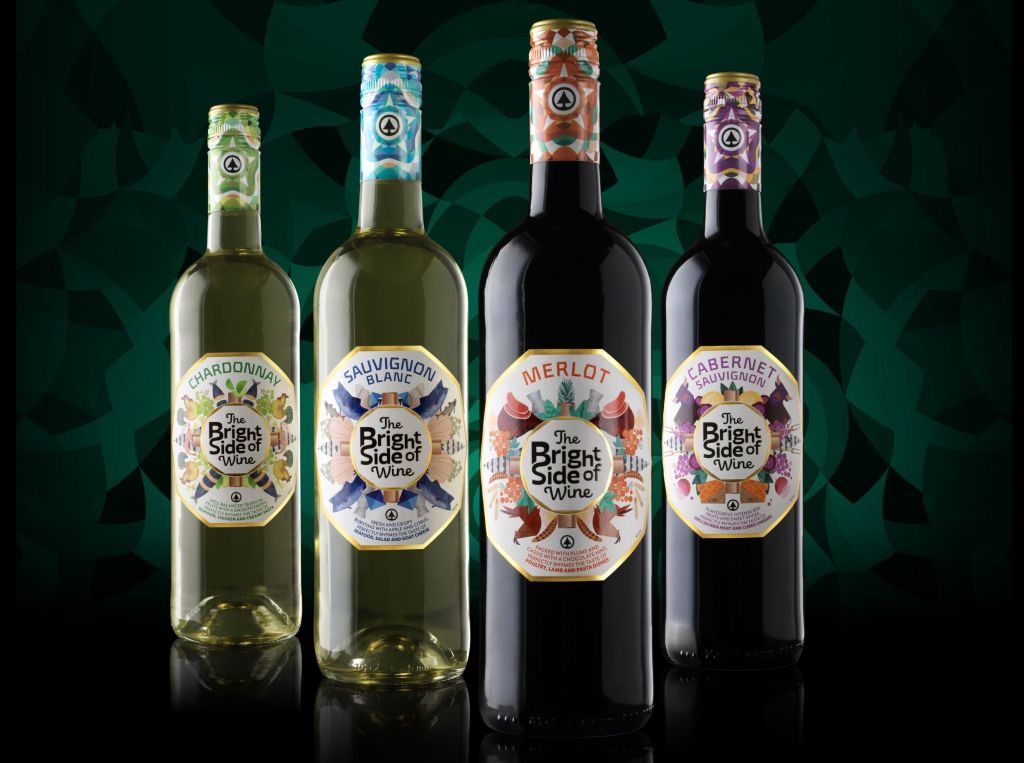
This caleidoscope of taste and foodpairing options, offers you the bright side of life. Just relax and enjoy. No worries if your chosen wine is a good match with your food. The elements of the design that build the caleidoscope effect give you insights of what to expect from the wine and how to combine it. Sauvignon blanc pairs nicely with fish and seafood; Chardonnay with chicken, Merlot with beef and Cabernet Sauvignon with more strong flavours like ham and cheese.
It’s a fresh, fun design that is your guiding hand in the labyrinth of the wine shelf.
Isn’t that the bright side of life?
YELLOW DRESS RETAIL
Nieuwendammerdijk 538
1023 BX Amsterdam
+31 (0) 20 632 02 40
info@ydretail.com