
This case examines the makeover we gave SPAR supermarket chain to assist them to better fulfil the needs and wishes of the contemporary society. At Yellow Dress Retail (YDR), we ensure that our clients don’t lag behind, but instead keep up with the times!
“Due to its retail expertise, YDR is really part of our integral development process." Jan-Hein van Spaandonk - Manager Private Label and Price at Spar Holding Netherlands
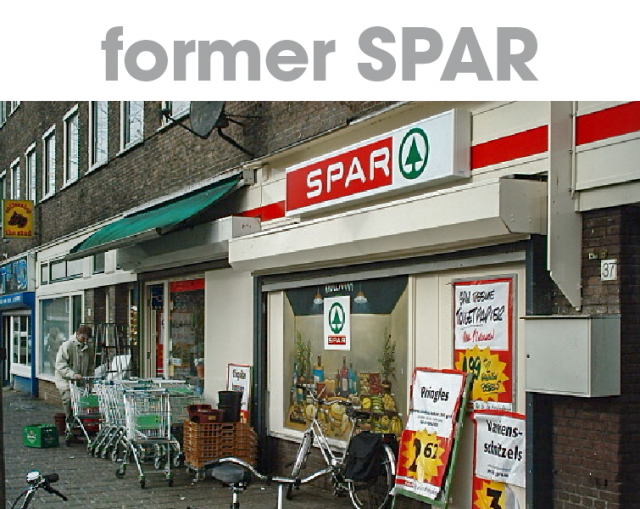
We have been working with SPAR since 2011. The first branch of this Dutch supermarket opened in 1932 in the Netherlands, and now operates worldwide. SPAR’s mission is to contribute to people’s quality of life by offering good quality food with a personal touch. Local entrepreneurs run the stores, and SPAR engages in environmentally friendly initiatives. We love what SPAR represents, but the company image had some serious work to do in the Netherlands.
Our new packaging design was the result of a well thought-out process:
SPAR was very pleased with the work we did on the new SPAR Private Label. However, the new packaging concept now emphasised the outdated appearance of the shops and the brand communication. We needed to take the next step. When updating a brand you have to cover all the bases – think of it as a Gesamtkunstwerk! All retail/costumer touchpoints should communicate the same brand equity. Tackling only one part is not enough. After developing the New Private Label, YDR also became responsible for the development of a new SPAR visual identity, and in cooperation with SPAR other touchpoints were reshaped. Just looking at the remarkable differences between the old and the new supermarket facade and interior. The new design immediately gives SPAR a more global and attractive look. The SPAR flyers now boast bright, attractive colours and high-quality photographs, necessary in our high-tech visual age.
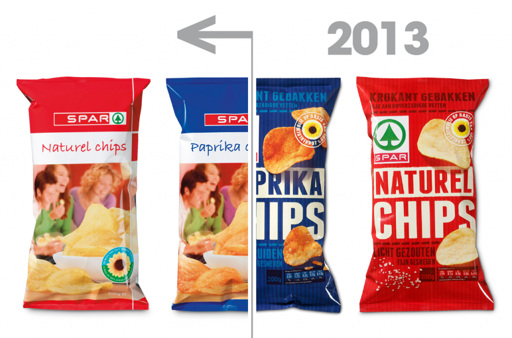
In a rapidly changing society, it’s important to stay closely connected with your customers. This is one of the main reasons why the life cycle of retail brands is getting shorter and shorter. After the success of the SPAR Private Label, we started to prepare for the next step.
To evaluate the current SPAR Private Label we used our global trend presentation, which we annually produce in-house for our clients to monitor changing consumer lifestyles. We started in early 2016, driven by global trends to evaluate the existing brand visualisation (Private Label – store design – instore – outdoor – shop communication – campaigns).
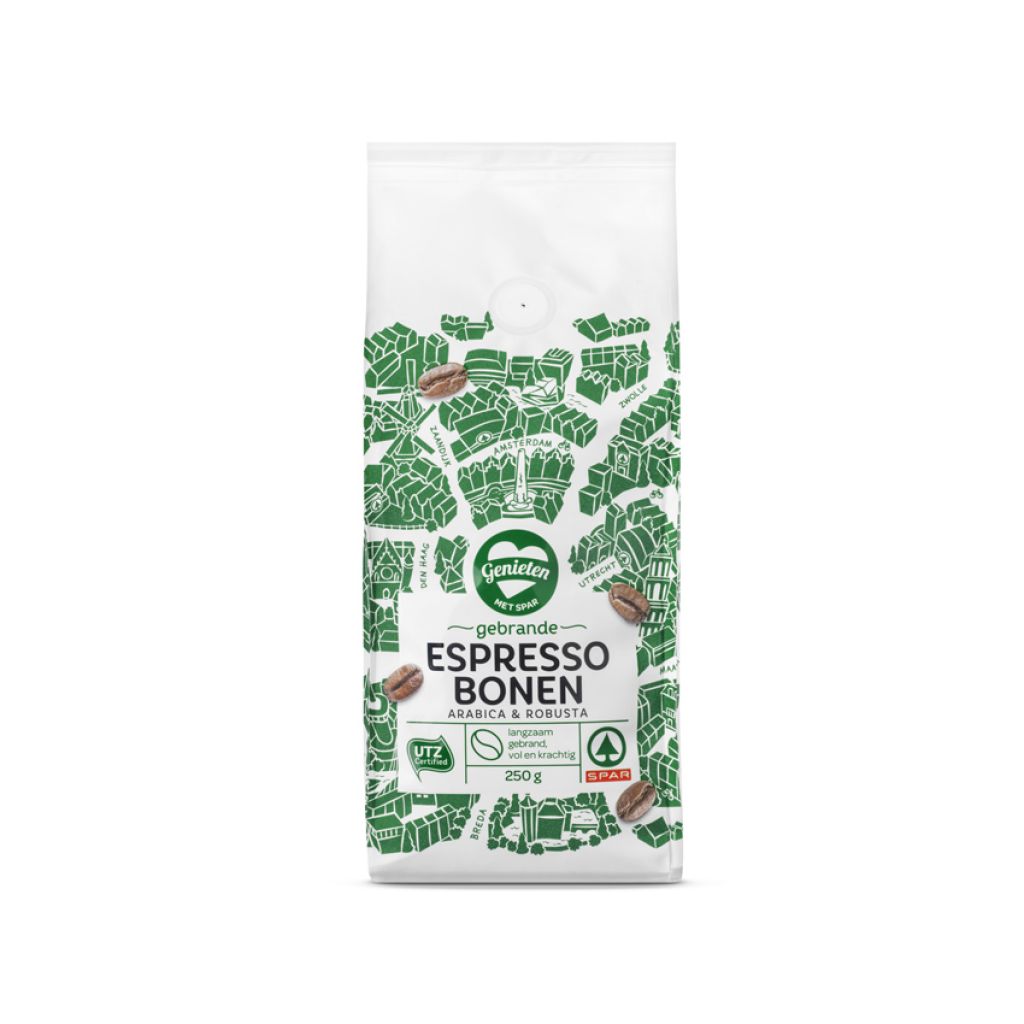
After thorough analyses, YDR developed several Private Label concepts. In line with the latest global trends, SPAR chose the “clean slate” concept as the way forward.
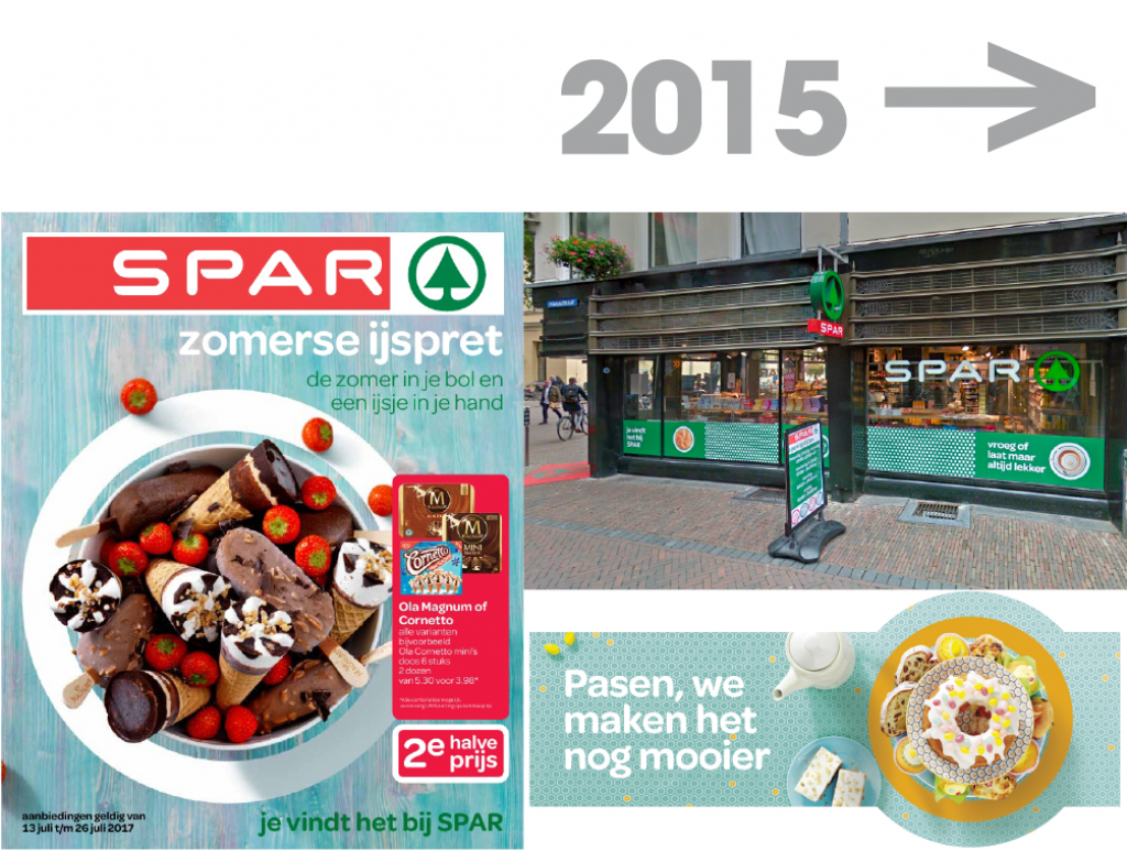
Following the vision of YDR, we again used the newly developed SPAR Private Label concept as a starting point for all customer touchpoints. In the 2016 case, YDR was also invited to develop new store and promotional communication, making it possible to address the SPAR project as an integrated case.
Alongside the new Private Label concept we developed an updated visual identity leading to a new communication language. For the revised visual identity, we went back to the roots of the SPAR logo. The original SPAR logo was designed by Raymond Loewy (1893-1986), who was one of the most famous industrial designers of the 20th century. With respect to Mr. Loewy’s design, we developed an ownable look and feel that corresponds with SPAR’s updated visual identity.
YELLOW DRESS RETAIL
Nieuwendammerdijk 538
1023 BX Amsterdam
+31 (0) 20 632 02 40
info@ydretail.com