
The redesign of Melkan had the goal to create a more A-brand feeling and adding impact on the shelf.
For more than 200 SKU’s, the challenge in design was the creation of a unique, yet versatile grid, that establishes brand-visability without uniformity,
Our creative solution was to emphasize nature’s flavours that help you enjoy everyday moments. The visual language communicates nature and taste appeal. The illustrations are suggesting the experience of an outdoor-moment. The photography is fresh, appetizing and flavourful.
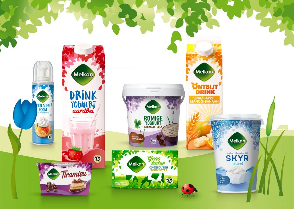
The logo has been recognizable adapted to a friendlier version: corners rounded, typo more playful, background with a shine and 3D appearance.
We created a recognizable, yet dynamic grid that gives a consistent feeling of the brand but also communicates individual propositions of the different categories and subranges.